Introduction
Matplotlib provides users with the ability to generate pie charts through the matplotlib.pyplot.pie function. This tutorial will walk you through the creation and generation of a simple pie chart, and introduce you to some of the more common plotting options and methods associated with the creation of high-quality, good looking pie charts.
If you are new to Matplotlib you should consider first reading through our Comprehensive Introduction to Matplotlib before continuing with this tutorial. This will take you through the basics of working with Matplotlib and the object-orientated approach to plotting which we use but is not covered here.
Imports
You need to import the Matplotlib package before working with it. We'll be working with the pyplot module in this tutorial which should be imported as follows:
import matplotlib.pyplot as plt
Pie Charts in Matplotlib
Once you've made the import you can start working with the package. Pie charts are generated using the matplotlib.pyplot.pie function.
The pie function is shown below; we'll cover some of the more commonly used parameters through a worked example. The full doucmentation is available here as a reference.
matplotlib.pyplot.pie(x, explode=None, labels=None, colors=None,
                      autopct=None, pctdistance=0.6, shadow=False,
                      labeldistance=1.1, startangle=0,
                      radius=1, counterclock=True, wedgeprops=None,
                      textprops=None, center=(0, 0), frame=False,
                      rotatelabels=False, *, normalize=True, data=None)
- x is the only required parameter, and is a 1D array that is used to generate the slices of the pie chart. The fractional area of each slice is given by
x/sum(x). - Pie slices are plotted counterclockwise by default. Add the argument
counterclockwise=Falseto reverse direction of the slice generation. - labels are a sequence of strings that provide a label for each slice or wedge of the pie chart.
- labeldistance is the radial distance at which the labels are drawn. The default is
labeldistance=1.1, while the defaultradius=1. - colors is a sequence of colors through which the pie chart will cycle. The default of
colors=Nonewill auto assign colors to the slices from the current active color cycle. - explode allows you to apply an offset to the radius of each slice of the pie chart in order to highlight a particular slice of the pie. If not the default
explode=None, then explode must be an array equal to the length of the number of slices (len(x)) where each entry specifies the fraction of the radius to offset that slice of the pie chart. - autopct is used to label each slice with it's numeric value. The label is placed inside each slice. A string or function should be used to label each slice. You can use a format string such as:
autopct='%1.1f%%'would write out a percentage with one decimal point e.g. '78.0%'.autopct='%1.3f%%'would write out a percentage with three decimal points e.g. '78.029%'.
- pctdistance is used to control where inside the slice autopct is printed. It defines the ratio between the center of each pie slice and the start of the text generated by autopct. The default value is
pctdistance=0.6. - startangle is the angle at which the first slice of the pie is drawn relative to the x-axis and in a counterclockwise sense. If you consider a clock:
startangle=0starts the first slice at 3 o'clock.startangle=90starts at 12 o'clock.startangle=180starts at 9 o'clock.startangle=270starts at 6 o'clock.
- textprops accepts a dict of arguments to pass to all text objects in the pie. This allows you to control, among other parameters: fontsize, color, or fontstyle. For example you could pass
textprops={'fontsize': 16, 'fontweight':'bold','color':'red'}.
Pie Chart Worked Example
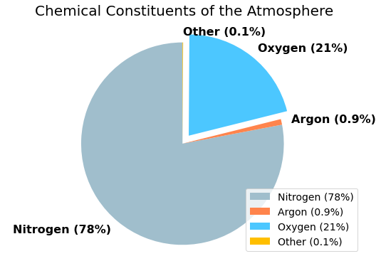
Let's go through a worked example now where we generate a pie chart showing a breakdown of the various gases in the Earth's atmosphere. 99.9 % of the atmosphere is comprised of three gasses, dominated by nitrogen and oxygen. The breakdown is shown in the dictionary below which forms the input into our chart.
atm = {
    'Nitrogen':78,
    'Argon':0.9,
    'Oxygen':21,
    'Other':0.1,
}
The code required to build the pie chart is shown in the codeblock below. Some of the features of the chart code are:
- Customised labels with the gas name and percentage built into the label. This was favored over working with
autopctin this instance due to the very small values for 'Argon' and 'Other'. - The 'Oxygen' slice was exploded to highlight that the atmosphere is comprised of 21% oxygen.
- Custom slide colors were specified.
- The pie was rotated by 90 degrees to better highlight the oxygen slice.
ax.axis('equal')ensures that the pie is drawn as a circle.- A legend was added to the bottom right corner.
import matplotlib.pyplot as plt

atm = {
    'Nitrogen':78,
    'Argon':0.9,
    'Oxygen':21,
    'Other':0.1,
}

gases = atm.keys()
values = atm.values()

percentage = list(values)
label = []
for i, gas in enumerate(gases):
    label.append(f"{gas} ({percentage[i]}%)")

explode = (0, 0, 0.1, 0)
colors = ["#A0BECC","#ff844c","#4cc7ff","#ffbf00"]

fig, ax = plt.subplots(figsize=(9,6))
ax.set_title('Chemical Constituents of the Atmosphere',fontsize=20,pad=12)

ax.pie(x=values, explode=explode, colors=colors, labels=label,
       startangle=90,labeldistance=1.1, counterclock=True,
       textprops={'fontsize': 16, 'fontweight':'bold'})

ax.axis('equal')  # Equal aspect ratio ensures that pie is drawn as a circle.
ax.legend(loc='lower right',fontsize=14)
The resulting pie chart clearly highlighs that the majority of the atmosphere is comprised of nitrogen and oxygen and that oxygen accounts for just over one-fifth of the atmosphere.

That concludes this tutorial on building pie charts using Matplotlib. The code used to generate the chart can be used to form a template that you could use for any subsequent pie chart plots.
Thanks for reading and I hope that this is a useful guide to producing good looking and high quality pie charts in Matplotlib. If you found this helpful then please consider sharing it with you friends/co-workers/colleagues. This is how we are able to grow our Python community and continue to deliver free high-quality content.