
A large part of scientific and technical Python work involves processing raw numerical data, and then presenting it in a form that can be quickly and easily understood by your intended audience. To that end, a comprehensive visualization package is absolutely essential. The de facto standard in Python is the Matplotlib library, and so we'll devote a number of tutorials to the package — starting with this introduction and then moving onto more specific plot types.
What is Matplotlib
Matplotlib is a comprehensive plotting library that allows you to create static, animated, and interactive visualizations in Python. If you are completely unfamiliar with the package then you can think of it as similar to Excel Charts but with tons more functionality. One big difference between the two is that the scope for creating completely customised plots, to exactly fit your specific needs, is much greater when using Matplotlib. Another key difference is that since Matplotlib figures are created through writing code your visualisations are also infinitely scalable — this means you can write the code required to create a particular type of plot once and then reuse that as a boilerplate for many similar applications.
Installation
Matplotlib is a Python package that must be installed before use. Recommended installation is through the pip or conda interface.
pip install matplotlib
conda install matplotlib
As is the case with the NumPy package, Matplotlib is so widely used that there are many scientific python distributions that come preinstalled with Matplotlib. This is the recommended way to get started as the distribution will come bundled with a set of complementary modules that will allow you to perform any scientific or analytical analysis.
Two of our favourites are Anaconda and WinPython.
Once Matplotlib is installed you must not forget to inport the module whenever you wish to use it. Most of the time you will work with the pyplot object which is imported as shown below.
import matplotlib.pyplot as plt
If you need to work with the Matplotlib module in its entirety then the convention is to import this with the alias mpl. Finally you will almost certainly be working with NumPy is conjunction with Matplotlib, which is conventionally imported as np.
import matplotlib as mpl
import numpy as np
Now that you have a working version of Matplotlib installed and ready to go, we can start by looking at the foundations of the Matplotlib Figure. Understanding the make-up of this object will help you greatly when working with the module and creating your own plots.
Components of a Figure
Matplotlib is designed to be used with an object-orientated approach. A Matplotlib Figure is therefore composed of a number of different objects built up to form the final plot. The image below showing the make-up of a Figure comes directly from the Matplotlib documentation, which is very comprehensive and a great reference as you continue to work with the package.

As eluded to above it is helpful to think of the Matplotlib Figure as a number of building blocks stacked on top of one-another to create your plot.
- The base of the figure is the
plt.figureobject which you will call to instantiate a new figure. - Sitting on top of this figure is the
Axesobject which houses all the components that go into a completed figure (axes, titles, grids, legends, axis labels, and of course the actual data being plotted).
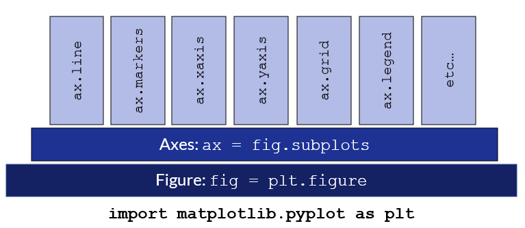
Figure
The figure object is the parent container inside which the plot (or multiple plots added as subplots) are housed. The most common way to create a new figure is through pyplot.
import matplotlib.pyplot as plt
fig = plt.figure() # empty figure with no axes object
fig,ax = plt.subplots() # create the figure an axes together by calling plt.subplots()
The majority of the time you will want to create the figure and the axes at the same time, using the plt.subplots method.
matplotlib.pyplot.subplots(nrows=1, ncols=1, *, sharex=False, sharey=False, squeeze=True, subplot_kw=None, gridspec_kw=None, **fig_kw)
Using this method you can create a single axes object (default), or multiple axes if you wish to create a figure with subplots. The nrows and ncols parameters define the number of subplot axes to create.
fig, ax = plt.subplots() # single axes
fig, (ax1,ax2) = plt.subplots(nrows=1,ncols=2) # two axes created one below the other
Axes
The Axes class sits on top of the Figure and contains the region where the components of the plot are drawn. This includes the data to be plotted, two axis objects (Axes.xaxis and Axes.yaxis) in the case of a 2D graph, all labels and titles, the grid, and the legend.
The majority of the methods and functions that you'll be working with to create a visualization are housed within the Axes class.
Plotting Methodology
There are two distinct ways to approach the creation and population of a figure in Matplotlib.
- The preferred approach is to explicitly create the figures and axes, and then call methods on them to customise the figure to your preference. This is an object-orientated approach which is more pythonic and hence preferred.
- The second approach is to allow pyplot to automatically manage the figures and axes, and then use pyplot functions to customise the plot. This approach is more intuitive to users who are used to working in a MATLAB environment.
We will show both methods, but will then continue the tutorial exclusively making use of the preferred object-orientated approach.
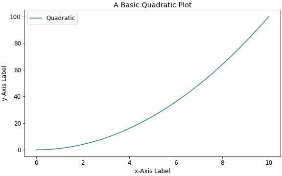
Pyplot Automated (MATLAB Type Approach)
The pyplot automated approach will be more intuitive to those users who are familiar with the MATLAB approach to plotting. The plotting style is implicit and works well for simple plots. For more complicated plots the object-orientated api is preferred, and if you are new to Matplotlib it is suggested that you focus your time and effort learning the object-orientated methodology for all plotting.
x = np.linspace(0, 10, 100)
y = x**2

plt.figure(figsize=(8,6))
plt.plot(x, y, label='quadratic')
plt.xlabel('x-Axis Label')
plt.ylabel('y-Axis Label')
plt.title("A Basic Quadratic Plot")
plt.legend()
Runing the script generates a simple graph.
Object Orientated (Preferred)
This is the preferred method of generating plots where the Figure and Axes are explicitly created. Thereafter the applicable methods are called on the Axes class to populate the figure.
x = np.linspace(0, 10, 100)
y = x**2

fig,ax = plt.subplots(figsize=(8,6))
ax.plot(x,y,label='quadratic')
ax.set_title('A Basic Quadratic Plot')
ax.set_xlabel('x-Axis Label')
ax.set_ylabel('y-Axis Label')
ax.legend()
Data Input
Matplotlib has been designed to accept a numpy.array as an input but will also accept any object that can be passed to a numpy array. This includes lists, tuples, dictionaries and the Pandas DataFrame. It's good practice to convert your data into a numpy array before plotting it; this ensures that no anomalies are introduced during plotting. However, if you are working with a list, dictionary, or a DataFrame you should have no issues calling that data directly into the plot.
If you are working with a dictionary or a DataFrame you can actually call the entire object into the plot using the data keyword argument, and then refer to the specific data you wish to plot by calling the required variables by their name.
plot_dict = {
    'x-values': np.array([2,4,6,8,10]),
    'y-values': np.array([8,16,24,32,40])
}
fig,ax = plt.subplots()
ax.plot('x-values','y-values',data=plot_dict)
Basic Styling
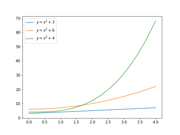
Let's now move onto some basic plot styling. Let's start by creating a simple graph where we plot three lines which will be styled by the default settings. We can then go through and add custom colors, line-styles, line-widths, and markers to our plot.
First we'll write some code to plot equations of the form:
$$y = x^{n} + c$$
In this case we will specify n and c as a list. By looping through the list we can plot as many lines as there are constants in the list. The code is shown below.
import matplotlib.pyplot as plt
import numpy as np

"""
create a simple plot where we draw lines with
equation: y = x^{n} + c.
"""
x = np.linspace(0, 4, 15) # our domain
exponents = np.array([1,2,3]) # list of exponents
consts = np.array([3,6,4]) # list of constants

fig,ax = plt.subplots()
for i,exp in enumerate(exponents):
    y = x**(exp)+consts[i]
    label = f"$y=x^{exp}+{consts[i]}$"
    ax.plot(x,y,label=label) # plot each line by looping through list of exp and consts
ax.legend()
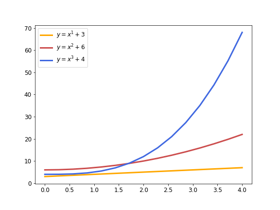
Running this script with the default Matplotlib settings generates the following graph:
We'll now go ahead and modify the appearance of the plotted lines. In all cases we add the required styling to the Axes.plot method.
Line Width
The line width is modified by adding the linewidth argument to the plot method. Line width is specified in points.
ax.plot(x,y,label=label,linewidth=3)
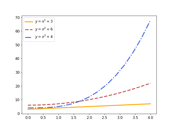
The shorthand lw can be used in place of writing out linewidth. Modifying the ax.plot method as shown above and rerunning the script produces a graph with noticably thicker plot lines.
Color
By default each line plotted on an axes will be a different color. There are a set of ten default colors defined in rcParams["axes.prop_cycle"] that will be cycled through when plotting without setting the colors manually.
To modify the color of any line in a plot, add the color argument to that specific plot method. The shorthand 'c' may also be used.
ax.plot(x,y,label=label,color='red')
Matplotlib recognises a large assortment of color formats; the full list is shown here. Some of the more common ways to specify a color are:
- Through the Matplotlib predefined list of named colors: e.g.
'darkorange','royalblue','aquamarine'. - Matplotlib single character shorthand notation: e.g.
'k'- black,'b'- blue,'r'- red,'w'- white,'g'- green. - You can specify any hex color code as a string and Matplotlib will plot in that color: e.g.
"#ffa700","#1e3294". - An RGB or RGBA
(red,blue,green,alpha)tuple of float values in the closed interval[0,1]: e.g.(0.8,0.3,0.3),(0.25,0.38,0.40,0.5). - Grayscale colors can be represented by a float value in the interval
[0,1]with'0'as black and'1'as white.
In our example we will specify three colors for our three plot lines in a list and then loop through the list to extract the relevant color during plotting.
colors = ['#ffa700',(0.8,0.3,0.3),'royalblue']

fig,ax = plt.subplots()
for i,exp in enumerate(exponents):
    ...
    ax.plot(x,y,label=label,linewidth=3,color=colors[i])
The resulting plot now paints the lines using the three colors we specified.
Line Style
Line styles work in a similar manner to line colors and are 'solid' by default. To change the line style add the linestyle argument to the plot method. The shorthand for linestyle is ls. Simple linestyles can be defined by the strings 'solid', 'dashed', 'dashdot' and 'dotted'.
To tailor your linestyle to a precise need you can provide a dash tuple of the form (offset,(on_off_seq)). To learn more about customized linestyles in Matplotlib you can refer to the applicable documentation.
ax.plot(x,y,label=label,linestyle='dashed')
For our example we will define three linestyles in a list and loop through the list as the plot is created to assign a different linestyle to each line plotted.
style = ['solid','dashed','dashdot']

fig,ax = plt.subplots(figsize=(8,6))
for i,exp in enumerate(exponents):
    ...
    ax.plot(x,y,label=label,linewidth=3,color=colors[i],linestyle=style[i])
ax.legend()
Our plot will now show the linestyles specified.
Markers
Markers are not visible by default in the Axes.plot method and may be used on plot, scatter, and errorbar plots. Markers are specified using the marker argument. A few common markers are tabled below; for a complete list of markers refer to the official documentation.
| Marker Code | Description |
|---|---|
'o' |
Circle |
'.' |
Point |
'^' |
Up Triangle |
'v' |
Down Triangle |
's' |
Square |
'P' |
Filled Plus |
When specifying a marker style you will want to consider both the marker type (e.g. circle, square) and the marker size (markersize).
ax.plot(x,y,label=label,marker='o', markersize=10)
By default the marker color will be the same as the line color. If you want the marker to be a different color to the line then you must additionally specify the markerfacecolor and markeredgecolor. The width of the markeredge is modified through markeredgewidth.
ax.plot(x,y,label=label,marker='o',markersize=10,markerfacecolor='red',markeredgecolor='black')
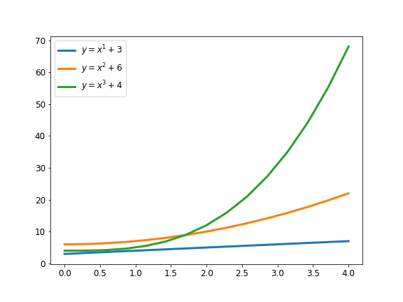
Back to our example plot we will create a list with three different markers and then loop through the list to set our markers in the plot. Additionally we'll add a black edge to the markers, and thicken them slightly to make them more prominent.
markers = ['o','^','v']

fig,ax = plt.subplots()
for i,exp in enumerate(exponents):
...
ax.plot(x,y,label=label,linewidth=3,color=colors[i],
        linestyle=style[i],marker=markers[i],
        markersize=10,markeredgecolor='black',
        markeredgewidth=1.5)
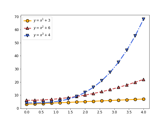
Our plot now has prominent markers in the same color as the plotted line but with a thicker black outline.
Final Line Styling
The final code to create and style our plot is copied out below:
x = np.linspace(0, 4, 15)
exponents = np.array([1,2,3])
consts = np.array([3,6,4])
colors = ['#ffa700',(0.8,0.3,0.3),'royalblue']
style = ['solid','dashed','dashdot']
markers = ['o','^','v']

fig,ax = plt.subplots(figsize=(8,6))
for i,exp in enumerate(exponents):
    y = x**(exp)+consts[i]
    label = f"$y=x^{exp}+{consts[i]}$"
    ax.plot(x,y,label=label,linewidth=3,color=colors[i],
            linestyle=style[i],marker=markers[i],
            markersize=10,markeredgecolor='black',
            markeredgewidth=1.5)
ax.legend()
Axes and Labels
We now turn our attention to adding titles, axis names, descriptions, scales, axis limits and annotations to our figures.
Title
To add a title to a figure you use the set_title method within the Axes class and supply a title string.
Axes.set_title(label, fontdict=None, loc=None, pad=None, *, y=None, **kwargs)
You can modify the font-size, font-weight, color and alignment of the title either by modifying the fontdict dictionary which controls the appearance of the title text, or through the text keyword arguments.
fig,ax = plt.subplots()
...
ax.set_title(label='This is the Figure Title')

# more label options:
ax.set_title(label='This is the Figure Title',fontsize=14, pad=8.0,loc='center')
# loc = {'center','left','right'}
# pad: offset the title from the top of the axis in points
The default fontdict is setup as follows:
{'fontsize': rcParams['axes.titlesize'],
 'fontweight': rcParams['axes.titleweight'],
 'color': rcParams['axes.titlecolor'],
 'verticalalignment': 'baseline',
 'horizontalalignment': loc}
Axis Labels
Axis labels are created using the set_xlabel and set_ylabel method in the Axes class.
Axes.set_xlabel(xlabel, fontdict=None, labelpad=None, *, loc=None, **kwargs)
# loc = {'center','left','right'}
Font-size, font-weight and color can be modified in the same manner as the title using the optional Text keywords.
fig,ax = plt.subplots()
...
ax.set_xlabel('x-Axis Label')
ax.set_ylabel('y-Axis Label', fontsize=20, fontweight=700)
Axis Scales
The x and y scale is set using the Axes.set_xscale and Axes.set_yscale methods respectively. The scale can be set as either, linear (default), log, symmetrical log, logit, or you can provide your own arbitrary scale with a user supplied function.
Axes.set_yscale(value, **kwargs)
# value = {"linear","log","symlog","logit",...}
You will likely most often use the default linear scale or a log scale in practice.
fig,ax = plt.subplots()
...
ax.set_xscale("linear")
ax.set_yscale("log")
Axis Limits
The range or limits of your axes are set using the Axes.set_xlim and Axes.set_ylim methods.
Axes.set_xlim(left=None, right=None, emit=True, auto=False, *, xmin=None, xmax=None)
Typically you will specify a left and/or right limit which is passed as the first two positional arguments. Alternatively you can pass a tuple (left,right) as the first argument to set the limits.
ylimits = (2.3,4.2)

fig,ax = plt.subplots()
...
ax.set_xlim(left=3,right=6)
ax.set_ylim(ylimits)
Legend
You place a legend in your figure with the Axes.legend method.
Axes.legend(*args, **kwargs)
In most case you will create a label each line or datapoint in your figure with the label keyword. This is then automatically detected by the legend when Axes.legend is called.
fig,ax = plt.subplots()
ax.plot([3,4,6,7],[2,3,1,4],label='Label 1')
ax.plot([1,2,3,4],[6,7,8,9],label='Label 2')
...
ax.legend()

The location of the legend can be explicitly positioned with the loc parameter, the value of which is either a string or location code corresponding to the positions shown in the table below. Alternatively you can pass a tuple giving the coordinates of the lower-left corner of the legend.
The default location of the legend is set to 'best', which means that Matplotlib will position the legend in such a way that is deemed to best highlight the data in the plot, and least interfere with the ability to read and interpret the graph.
| Location String | Location Code |
|---|---|
| 'best' | 0 |
| 'upper right' | 1 |
| 'upper left' | 2 |
| 'lower left' | 3 |
| 'lower right' | 4 |
| 'right' | 5 |
| 'center left' | 6 |
| 'center right' | 7 |
| 'lower center' | 8 |
| 'upper center' | 9 |
| 'center' | 10 |
fig,ax = plt.subplots()
...
ax.legend(loc='lower left')
Annotation
There are many cases when you may wish to add some additional text to your plots. There are two ways to do so, using either Axes.text to add a simple string of text, or Axes.annotate if you wish to add text and an arrow between that text and a point on the graph.
Axes.text
This works best when you simply need to add some text to your plot area.
Axes.text(x, y, s, fontdict=None, **kwargs)
Specify an x and y coordinate point corresponding to the start of the text, and a string s containing the text. The default coordinate system maps to the plot data coordinate system, but this can be changed using the transform parameter. Calling the transform will normalize the coordinate system in terms of a tuple where (0,0) corresponds to the lower left and (1,1) the upper right of the plot area.
ax.text(0.25,0.5,'This is some text', transform=ax.transAxes)
# 25% along the x-axis and half way up the y-axis
You can change the font-size, font-weight, color etc as you would with any other labels on the graph.
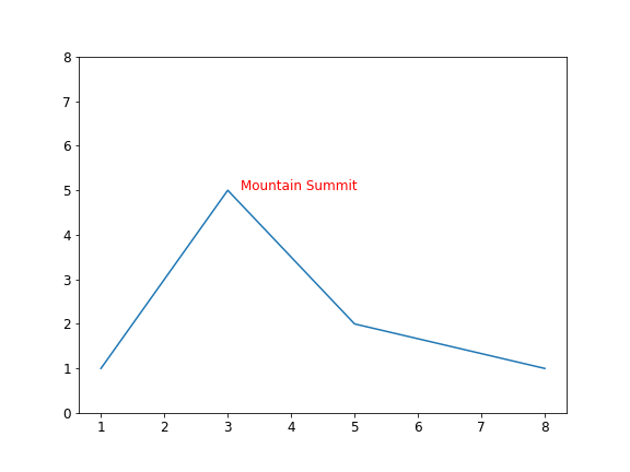
x = [1,2,3,5,8]
y = [1,3,5,2,1]
fig,ax = plt.subplots()
ax.plot(x,y)
ax.set_ylim(0,8)
ax.text(3.2,5,'Mountain Summit',fontsize=12,color='red')
The resulting graph with its text annotation is printed below.
Axes.annotate
If you are looking to annotate a plot and add an arrow pointing from the text to a point of interest then rather use the Axes.annotate method over the text method and remember to add the arrowprop parameter to the annotate method.
Axes.annotate(text, xy, xytext, arrowprops)
- text is simply the string of text to add
- xy refers to the coordinates of the point of interest. If no arrow is required then only specify xy and not xytext.
- xytext refers to the coordinates of the start of the text. An arrow will join xytext to xy.
- arrowprops is a dictionary specifying the properties of the arrow. We'll show a simple example below and link to the Matplotlib documentation where the creation of more complex arrow types is described further.
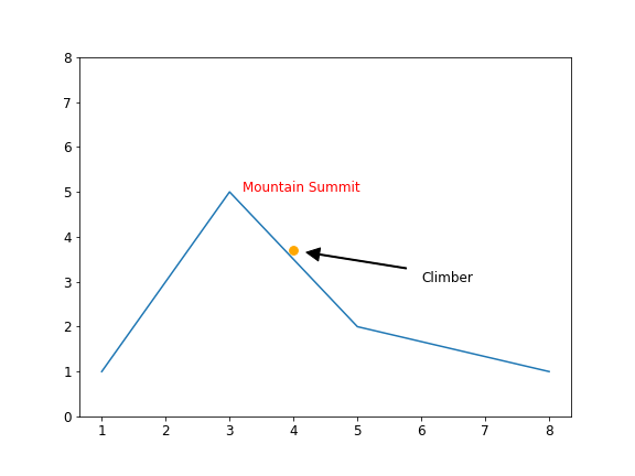
Let's use our mountain example again and this time add a climber on the side of the mountain with an arrow pointing to our intrepid adventurer.
x = [1,2,3,5,8]
y = [1,3,5,2,1]
climber = (4,3.7)

fig,ax = plt.subplots()
ax.plot(x,y)
ax.scatter(climber[0],climber[1],color='#ffa700',s=60)
ax.set_ylim(0,8)
ax.text(3.2,5,'Mountain Summit',fontsize=12,color='red')
ax.annotate('Climber',xy=climber,xytext=(6,3),arrowprops=dict(width=1,facecolor='k',edgecolor='k',shrink=0.1))
The coordinates of our climber is specified by a tuple which is then referred to in the ax.annotate method as the xy position where the arrow will end. The arrow is initiated at xytext which corresponds to the coordinates of our text annotation.
arrowprops is a dictionary with the properties of the arrow included. There are many properties and you are referred to the documentation for more information and example arrow types. What we have shown in this example is sufficient to size the arrow, add some color to its body and edges, and to shrink it slightly to make the annotation a little clearer — in our example we have shrunk the arrow by 10% which tends to work well.
arrowprops=dict(width=1,facecolor='k',edgecolor='k',shrink=0.1)
Multiple Axes in a Figure (Sub-plots)
Up to now we have worked with a single Axes on a figure. However, the subplot method is designed to create figures with multiple axes, i.e. you can create a grid of plots in a single Figure by specifying the number of rows and columns in the subplot method.
The axes are listed in a tuple and must be equal to the number of rows multiplied by the number of columns.
# axes should be listed in a tuple with length = rows x cols
fig,(ax1,ax2) = plt.subplots(nrow=2,ncols=1) # 2 rows x 1 column
fig,(ax1,ax2,ax3,ax4) = plt.subplots(nrow=2,ncols=2) # 2 rows x 2 columns
To show this in action let's create a plot with two axes arranged one below the other (2 rows and 1 col). We'll use the Axes.text method to label the two axes to clarify how the subplot is generated.
fig, (ax1,ax2) = plt.subplots(nrows=2,ncols=1, figsize=(8,10))
ax1.text(0.5,0.5,'ax1',transform=ax1.transAxes,fontsize=36,color='#cc0000',horizontalalignment='center',verticalalignment='center')
ax2.text(0.5,0.5,'ax2',transform=ax2.transAxes,fontsize=36,color='#cc0000',horizontalalignment='center',verticalalignment='center')
ax1.set_title('An Example of a Sub-plot',fontsize=18,pad=20)
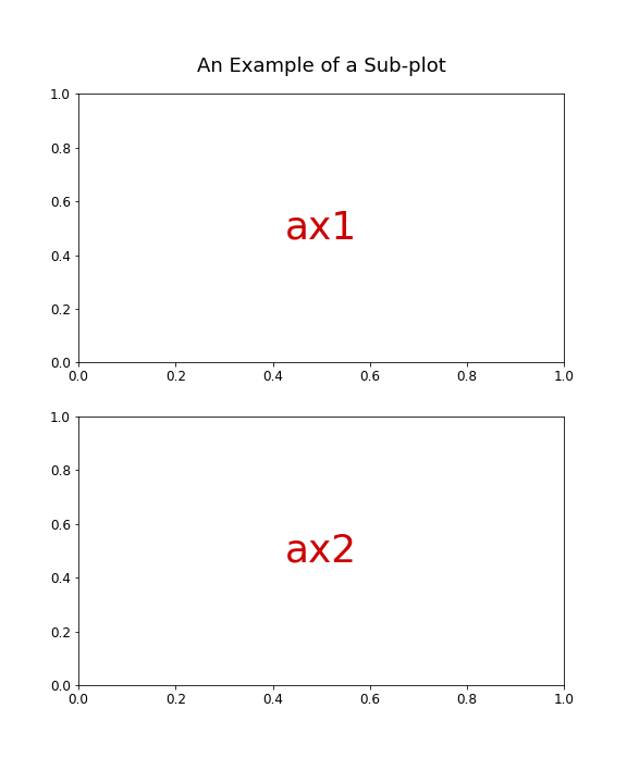
You can now work on the two axes as you ordinarily would. This allows two (or more) separate but related plots to be created on a single figure which often aids in the interpretation of the data visualisation.
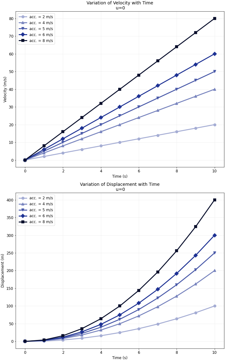
As we wrap up this tutorial let's put together everything we have learned and create a properly styled and labelled example sub-plot To make it somewhat meaningful we'll use the equations of motion to plot the variation of a body's speed and displacement with time.
Putting It All Together
We are going to use the well known relationship between speed, distance and time to generate a figure that plots the relationship between the three variables given an initial velocity and a constant acceleration.
The relevant equations are:
$$v_{i} = u_{0} + at_{i}$$
$$S_{i} = u_{0}t_{i} + \frac{1}{2}at_{i}^{2}$$
where:
\(u_{0} = initial\; velocity \)
\(v_{i} = velocity\; at\; time\; i\)
\(a = constant\; acceleration\)
\(S_{i} = displacement\; at\; time\; i\)
\(t_{i} = time\; i\)
We can write a short function to calculate the variation in velocity and displacement with time given an initial velocity input and a constant acceleration to apply to the body. We'll then return a dictionary with the relevant information that we can use for plotting.
def motion_eqns(u,a,t,intervals=10):
    tarr = np.linspace(0,t,intervals)
    vel = u + a*tarr
    disp = u*tarr + 0.5*a*tarr**2
    motion_dict = {
        'u':u,
        'acc':a,
        't_arr':tarr,
        'v_arr':vel,
        'd_arr':disp,
    }
    return motion_dict
Now we can call the motion_eqns function with some initial conditions and plot the resulting velocity and displacement on a sub-plot with two rows and a single column (one plot below the other). In this case we'll keep the intitial velocity at zero and loop through a list of varying acceleration.
import numpy as np
import matplotlib.pyplot as plt

# the code to generate the plot
alist = [2,4,5,6,8] # variation in acceleration

colorlist = ["#a5add4","#7884be","#4a5aa9","#1e3294","#090f2c"]
markerlist = ['o','^','v','D','s']

fig,(ax1,ax2) = plt.subplots(nrows=2,ncols=1,figsize=(10,16))
for i,acceleration in enumerate(alist):
    motion = motion_eqns(u=0,a=acceleration,t=10,intervals=11)
    axlabel = f"acc. = {acceleration} m/s"
    ax1.plot('t_arr','v_arr',data=motion,linewidth=3,color=colorlist[i],linestyle=None,marker=markerlist[i],markersize=8,markerfacecolor=colorlist[i],markeredgewidth=1.5,markeredgecolor=colorlist[i],label=axlabel)
    ax2.plot('t_arr','d_arr',data=motion,linewidth=3,color=colorlist[i],marker=markerlist[i],markersize=8,mec=colorlist[i],mew=1.5,label=axlabel)

ax1.set_title(f"Variation of Velocity with Time\n u={motion['u']}",fontsize='14')
ax1.set_xlabel('Time (s)')
ax1.set_ylabel('Velocity (m/s)')
ax1.grid(visible=True,color="#ebebeb")
ax1.legend()

ax2.set_title(f"Variation of Displacement with Time\n u={motion['u']}",fontsize='14')
ax2.grid(visible=True,color="#ebebeb")
ax2.set_xlabel('Time (s)')
ax2.set_ylabel('Displacement (m)')
ax2.legend()
The resulting figure is shown below. There is of course a lot more automation that we could perform with regards to setting markers and colors — a good exercise would be to create some functions that provide for an infinite number of colors and marker conbinations to be automatically generated to match the number of acceleration values input to the plot. This is left up to you as an exercise to complete in your own time.
Final Thoughts
We have covered a lot of ground in this tutorial and you should now have everything you need to create technical report level figures and graphs in Matplotlib. In future tutorials we'll cover some of the different types of plots that can be generated including scatter plots, histograms, bar graphs and pie charts.
Thanks for reading, it is our hope that this will serve as a useful reference where all the basics around plotting in Matplotlib are consolidated in a single place.
If you found this tutorial beneficial then please consider sharing it with your fellow students/friends/colleagues as this helps us to build our Python community. See you in the next tutorial!