This is a short tutorial on the matplotlib.pyplot.scatter function used to create scatter plots with Matplotlib. If you are new to Matplotlib and need a more comprehensive introduction to plotting in Python then rather start out with this post which covers everything from installation to plotting data and styling plots.
When to use a Scatter Plot
Scatter plots are used to visualize the relationship between two numeric variables by plotting each variable on a separate axis of a cartesian coordinate system. Visually representing the data on a graph makes it possible to infer relationsips between the two variables based on the pattern that the data makes when plotted.
Scatter plots are widely used in scientific ond statistical analysis and should be used instead of a line plot when the data is not continuous or the relationship between variables is unknown.
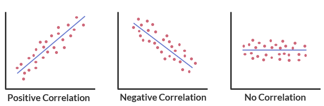
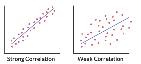
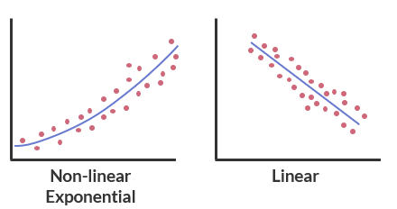
Correlation refers to the process of establishing a relationship between two variables, and can be described in terms of direction, strength, and linearity.
- Direction is classified as positive or negative.
- Strength of correlation is classified as strong or weak.
- The nature of the correlation can be described in terms of linearity: is the correlation linear or non-linear. If non-linear is there an exponential, hyperbolic, or no relationship between the data?
Scatter Plots in Matplotlib
Scatter plots are generated in Matplotlib using the pyplot.scatter function.
matplotlib.pyplot.scatter(x, y, s=None, c=None, marker=None,
                          cmap=None, norm=None, vmin=None,
                          vmax=None, alpha=None, linewidths=None,
                          *, edgecolors=None, plotnonfinite=False,
                          data=None, **kwargs)
- x and y refer to the coordinates of the data to be plotted.
- c is the shorthand for color. Refer to this list of possible values. Scatter point colors can also be specifed with a colormap (an example will be shown in one of the examples below).
- Marker type is modified with the marker parameter. Some marker types are shown here.
- If data is specified as a dictionary or Pandas DataFrame then you can refer to the x and y coordinates by the key or name.
Example Plotting Data
The aircraft_dict dictionary shown below contains a set of aircraft design parameters for seven aircraft, ranging from a single engine Cessna 172 that seats four, to a much larger twin turboprop de Havilland Dash 8 Q400 that seats approximately eighty-five.

aircraft_dict = {
    'C172S':{'TOW':1157,'WA':16.2,'AR':7.32,'Vc':122},
    'C210':{'TOW':1814,'WA':16.23,'AR':7.73,'Vc':180},
    'BE58':{'TOW':2313,'WA':18.5,'AR':7.19,'Vc':180},
    'B200':{'TOW':5760,'WA':28.2,'AR':9.78,'Vc':289},
    'Do328':{'TOW':13990,'WA':40,'AR':11,'Vc':335},
    'ERJ145':{'TOW':24100,'WA':51.2,'AR':7.84,'Vc':470},
    'Dash8': {'TOW':29260,'WA':63.1,'AR':12.78,'Vc':360},
}
The data in the dictionary is tabled below to make it a little easier to read.
| Aircraft | Takeoff Weight (kg) | Wing Area ($m^2$) | Aspect Ratio | Cruise Speed (KTS) |
|---|---|---|---|---|
| Cessna 1722S | 1157 | 16.20 | 7.32 | 122 |
| Cessna 210 | 1814 | 16.2 | 7.73 | 180 |
| Beech BE58 | 2313 | 18.5 | 7.19 | 180 |
| Beech B200 | 5760 | 28.2 | 9.78 | 289 |
| Dornier Do328 | 13990 | 40.0 | 11.0 | 335 |
| Emb ERJ145 | 24100 | 51.2 | 7.84 | 470 |
| Dash 8 | 29260 | 63.1 | 12.78 | 360 |
Varying the Marker Size
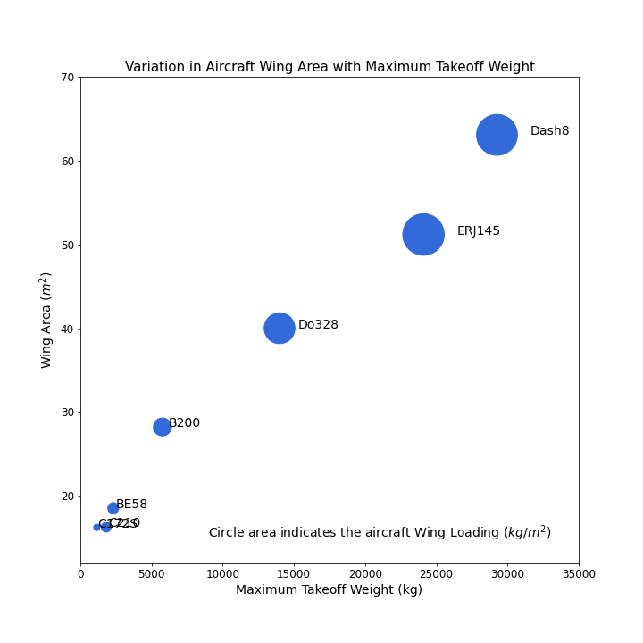
We'll start by plotting the maximum takeoff weight against the wing area to look for any correlation between the two.
One nice way of adding additional information (must aid in the interpretation of the data) to the plot is by varying the size of the marker by a third variable; in this case we will calculate a parameter known as the wing loading; which is the weight of the aircraft divided by the wing area. This provides some indication as to the lift density of the wing — aircraft with higher wing loadings produce more lift per wing square meter which is another way of saying that the high wing loadings mean a smaller wing for a given aircraft mass.
Higher wing loadings are visualised in our plot by larger marker areas. To produce this effect we have created an array of normalized (divided by the largest) wing loadings and fed this array into the markersize parameter in the scatter method.
Each data point is further labelled with the aircraft name to aid in interpretation. We have used the text method to do so. This is only possible to label each scatter point because the data set is small.
name = list(aircraft_dict.keys())
tow = []
wing_area = []
vcruise = []
for aircraft in aircraft_dict:
    tow.append(aircraft_dict[aircraft]['TOW'])
    wing_area.append(aircraft_dict[aircraft]['WA'])
    vcruise.append(aircraft_dict[aircraft]['Vc'])

WL = np.array(tow)/np.array(wing_area)
norm_WL = WL/np.max(WL)
marker_default = plt.rcParams['lines.markersize'] ** 2
n = 60
marker_size = n*marker_default*norm_WL**2

fig,ax = plt.subplots(figsize=(10,10))
ax.scatter(tow,wing_area,s=marker_size,c='#326ada')
ax.set_xlabel('Maximum Takeoff Weight (kg)',fontsize='14')
ax.set_ylabel(r'Wing Area ($m^2$)',fontsize='14')
ax.set_title("Variation in Aircraft Wing Area with Maximum Takeoff Weight",fontsize=15)
ax.text(9000,15,'Circle area indicates the aircraft Wing Loading ($kg/m^{2}$)',fontsize=14)
ax.set_xlim(0, 35000)
ax.set_ylim(12, 70)
for i,ac in enumerate(name):
    ax.text(tow[i]+1.1*marker_size[i],wing_area[i],ac,fontsize=14)
for item in (ax.get_xticklabels() + ax.get_yticklabels()):
    item.set_fontsize(12)
The resulting plot reveals two clear relationships:
- There is a positive linear relationship between the aircraft takeoff weight and the aircraft wing area. This makes intuitive sense as larger, heavier aircraft will need larger wings to produce the lift necessary to fly.
- Heavier aircraft also tend to have more highly loaded wings — this information is extracted from the plot by examining the resulting marker size.
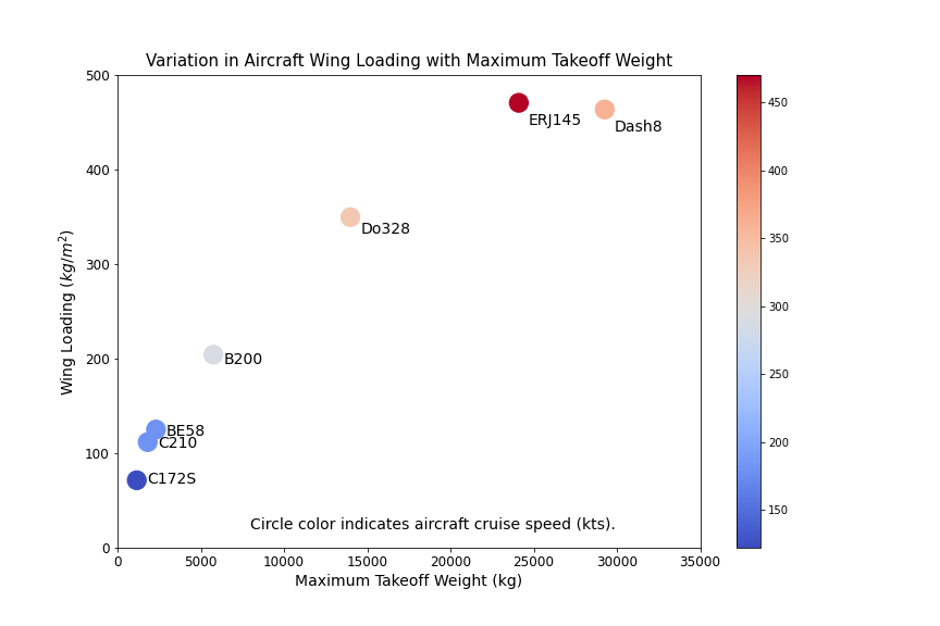
Varying the Marker Color
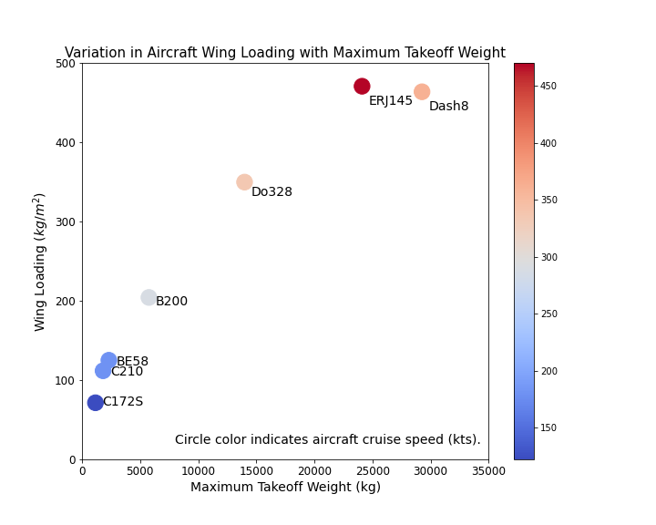
The scatter plot shown above highlighted that both the wing area and wing loading of an aircraft is a function of the aircraft's takeoff weight.
Let's now plot the wing loading against the takeoff weight to study that relationship, and then modify the marker color to aid in the interpretation of the result.
The code used is shown in the block below.
By specifying a cmap parameter and calling a list of aircraft cruise speeds into the color c parameter, Matplotlib will automatically assign a color to each marker based on the magnitude of the aircraft cruise speed.
set_marker_size = 300

fig,ax = plt.subplots(figsize=(10,8))
p1 = ax.scatter(tow,WL,s=set_marker_size,c=vcruise,cmap='coolwarm')
for i,ac in enumerate(name):
    ax.text(tow[i]+2*set_marker_size,0.95*WL[i],ac,fontsize=14,c='k')
ax.set_xlim(0, 35000)
ax.set_ylim(0, 500)
ax.set_xlabel('Maximum Takeoff Weight (kg)',fontsize='14')
ax.set_ylabel(r'Wing Loading ($kg/m^2$)',fontsize='14')
ax.set_title("Variation in Aircraft Wing Loading with Maximum Takeoff Weight",fontsize=15)
ax.text(8000,20,'Circle color indicates aircraft cruise speed (kts).',fontsize=14)
for item in (ax.get_xticklabels() + ax.get_yticklabels()):
    item.set_fontsize(12)
fig.colorbar(p1) # plot the colorbar
We have also added a colorbar to the plot by assigning a name to the scatter plot, and then calling the named scatter plot in the colorbar method.
fig,ax = plt.subplots(figsize=(10,8))
p1 = ax.scatter(tow,WL,s=set_marker_size,c=vcruise,cmap='coolwarm')
...
fig.colorbar(p1) # plot the colorbar
The resulting scatter plot is shown below.
- Positive linear relationship between wing loading and takeoff weight across the aircraft considered.
- Aircraft with higher cruise speeds are built with more highly loaded wings. Generally the larger the wing, the greater the drag produced by the wing, so a more highly loaded wing is more efficient than a less highly loaded one.
This brings us to the end of this tutorial on using the Scatter Plot functionality in Matplotlib. It is always nice to demonstrate a concept with some real world data — and so perhaps you have inadvertently also learnt a little about aircraft design. If you are interested in learning more about aircraft design then you can check out our sister site AeroToolBox.com for more aircraft related resources.
Thanks for reading and I hope this tutorial can be an aid to you as you continue to work with Matplotlib. Please consider sharing this if you found it useful. This helps us to build our Python community.