Introduction
Histograms are an important statistical analysis tool and are used to provide an approximate respresentation of the distribution of numerical data. To construct a histogram, the full set of numerical data is first classified into a number of bins, or non-overlapping intervals, such that each data entry is added to a single bin. These bins usually span the range of data in the dataset unless outliers are purposfully ignored. Once the data is classified, the frequency of data in each bin is determined by adding all entries in a given bin, and the resulting distribution is plotted with the bin intervals on the x-axis and the number of entries of each bin on the y-axis.
Matplotlib has a powerful histogram functionality built into the package which is accessed through the matplotlib.pyplot.hist function. We'll work through two examples in this tutorial, showing first how to create a simple histogram by plotting the distribution of average male height around the World, and then how to add two histograms to a single plot by adding the average female height to our first plot.
Imports
There are a few imports we need to make in order to complete this tutorial. In addition to matplotlib.pyplot which houses the hist function we will also be making use of the numpy, pandas, and statistics packages.
import matplotlib.pyplot as plt
import numpy as np
import pandas as pd
import statistics
The Matplotlib Histogram Function
Histograms are generated using the matplotlib.pyplot.hist method. The full documentation is available on the Matplotlib website, which you should refer to for any additional functionality not covered here.
matplotlib.pyplot.hist(x, bins=None, range=None, density=False,
                       weights=None, cumulative=False,
                       bottom=None, histtype='bar', align='mid',
                       orientation='vertical', rwidth=None,
                       log=False, color=None, label=None,
                       stacked=False, *, data=None, **kwargs)
- x is the only required argument when calling the
histfunction. These are the data input values which can be passed as a single array or a sequence of arrays which are not required to be the same length. Generally you will pass a single array of values to the function. - bins refers to the intervals to be created which will house the data. You can either pass an integer or a sequence to bins.
- If an integer is passed then this defines the number of equal-width bins in the range.
- If a sequence is passed, e.g. a list of values, then the bins are generated from the sequence where the edges of each bin are defined by adjacent entries in the list. The left-most adjacent value is included in the bin being created while the right-most adjacent value is not. The last bin is defined such that the both the left and right value is included.
- If you have defined bins as an integer then range can be used to define the upper and lower range of the bins. Outliers would then be ignored. If not specified, then the upper and lower range is automatically determined based on the minimum and maximum values in the input data.
- If
density=Truethen each bin will display that bins raw count divided by the total number of counts and the bin width. In other words a probability density will be returned. - You can weight your data using the weights parameter. Provide an array of the same shape a x where each corresponding value in weights will be multiplied by the raw data to weight it.
- If you would like to draw a cumulative histogram then set
cumulative=True. - rwidth refers to the relative width of the bars as a fraction of the bin width. If you set rwidth < 1 then you will introduce some whitespace between the bars.
- The color of the bars is set using the color argument.
- The alignment of the histogram bars is controlled through the
align:{'left','right','mid'}parameter. - To make use of a log scale on the histogram axis (y-axis) set
log=True. - histtype refers to the type of histogram to draw.
- The default is
histtype='bar'which is a traditional histogram type. histtype='barstacked'will stack multiple data on top of each other.histtype='step'refers to an unfilled lineplot.histtype='stepfilled'refers to a lineplot that is filled by default.
- The default is
- stacked is a bool which if
Truewill stack multiple data on top of one another.
Working with Pandas DataFrames
It is common to use the Pandas package alongside Matplotlib to analyse, store, and manipulate data before producing a plot in Matplotlib to visualize the result. We'll make use of Pandas in this tutorial to store our data in a Dataframe.
The convention is to import Pandas using the abbreviation pd.
import pandas as pd
Average Human Height Data Set
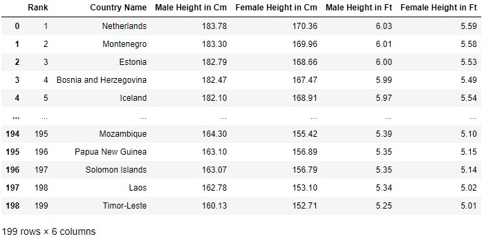
We will be using the Height of Male and Female by Country 2022 dataset to generate our histogram plots. This dataset has no copyright attached to it and can be downloaded here if you would like to follow along.
The dataset consists of the average height of a male and female human in 199 countries around the World. The heights are provided in metric (cm) and imperial (ft) units.
The pandas.read_csv method should be used to load the csv file containing the raw data into a new DataFrame.
df = pd.read_csv('Male_Female_Height_Country.csv')
An extract of the top and bottom of the resulting DataFrame is shown below:
To refer to a column in the dataset you use the column name as the key.
male_height = df['Male Height in Cm']
Generating the Histograms
We are now in a position to begin plotting histograms from the data provided. We'll start with a simple histogram showing the distribution of male height around the World, and then move onto a more complex plot where we will superimpose the male and female height data onto the same set of axes to investigate the differences in height and distribution of the two sexes.
Distribution of Male Height by Country
We will be working in metric units (cm) in this tutorial, but before we move on to plotting the height data we need determine our bin sizing.
Specifying Histogram Bins
Histogram bin sizing is set in the matplotlib.pyplot.hist function through the bins argument. You can specify an integer equal to the number of required bins to automatically create the bin intervals or you can pass a list to bins with your own bin intervals.
In this case I have elected to set my own bin intervals after examining the data. I've extracted the maximum and minimum heights from the dataset and printed these out to assist in determining the bin limits and intervals.
male_height = df['Male Height in Cm']
min_height = np.min(male_height)
max_height = np.max(male_height)

print(f"Min ave male height: {min_height} cm")
print(f"Max ave male height: {max_height} cm")
The resulting strings printed out show that average male height varies between 160.13cm and 183.78cm.
"Min ave male height: 160.13 cm"
"Max ave male height: 183.78 cm"
I'd prefer to work in whole numbers with this dataset when setting bin intervals and so will set the lower limit equal to 160cm and the upper limit equal to 184cm.
My bins are simply created using numpy.linspace.
bins = np.linspace(160,184,13)
# [160. 162. 164. 166. 168. 170. 172. 174. 176. 178. 180. 182. 184.]
Creating the Histogram Plot
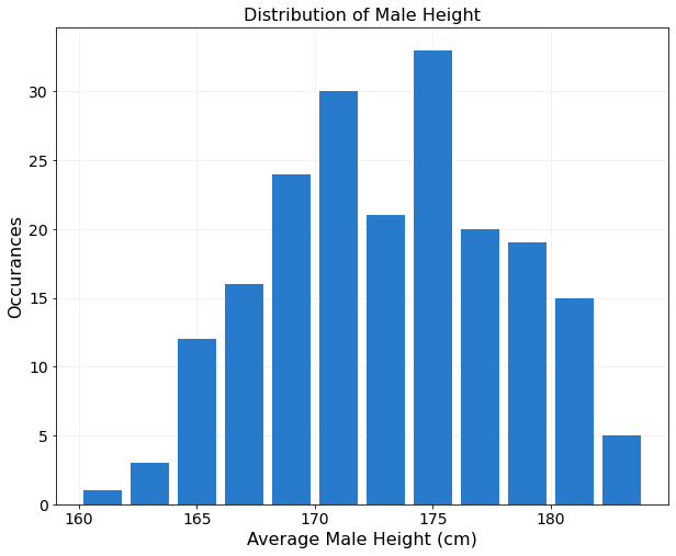
Now that the bins are specified let's move onto the actual plot. The code is shown below where I have customised the color of the histogram bars and also added a little whitespace between bars (rwidth=0.8).
male_height = df['Male Height in Cm']
bins = np.linspace(160,184,13)

fig,ax = plt.subplots(figsize=(10,8))

ax.hist(x=male_height,bins=bins,rwidth=0.8,color='#287ACC')

ax.set_xlabel('Average Male Height (cm)',fontsize=16)
ax.set_ylabel('Occurances',fontsize=16)
ax.set_title('Distribution of Male Height',fontsize=16)
ax.grid(visible=True,color="#f0f0f0",axis='both')
ax.set_axisbelow(True)
for item in ax.get_xticklabels() + ax.get_yticklabels():
    item.set_fontsize(14)
I added a grid to the plot to make it easier to read off the number of occurances at the various heights, and included the line ax.set_axisbelow(True) to send the grid to the back of the plot, which improves the readability of the plot.
The resulting histogram is shown below.
Multiple Histograms on a Single Axis
We would expect that the average height of females around the World would be lower than that of males. Let's now modify the histogram created above to include both the male and female data on the same set of axes.
We'll need to modify the bins to make allowances for the minimum and maximum average heights across both the male and female dataset. I haven't show it here but have followed the same methodology as I did with just the male dataset to create a new set of bins for the plot.
newbins = np.linspace(150,184,18)
In order to plot the two datasets on the same x-axis I have used the twinx function which creates twin y-axes that share a common x-axis. The twinx function was also used in the bar graph tutorial which you can refer to as an additional reference.
The process to create the plot is as follows:
- First plot the male distribution on one set of axes.
- Create a second y-axis with common x-axis by calling the
twinxmethod. - Add the female dataset to the newly created axis.
- Match the male and female y-axes by joining them and calling the
get_shared_y_axesmethod.ax2.get_shared_y_axes().join(ax,ax2)
- Style all axes by creating labels, colors etc as required.
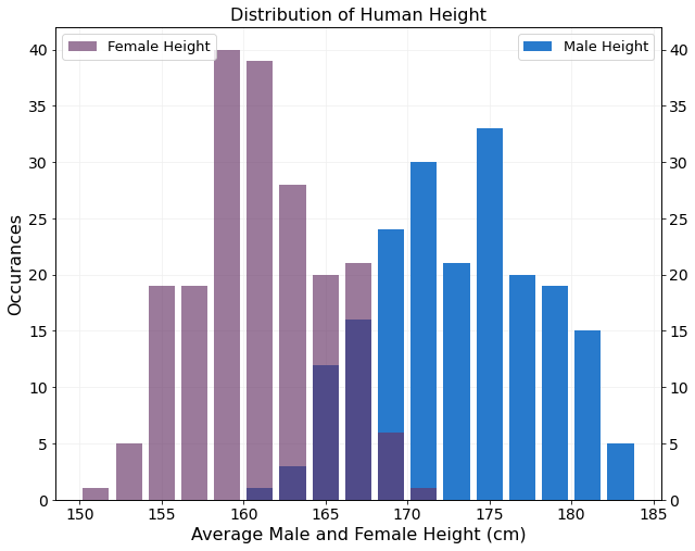
newbins = np.linspace(150,184,18)
rwidth = 0.8

fig,ax = plt.subplots(figsize=(10,8))

ax.hist(x=male_height,bins=newbins,rwidth=rwidth,
        color='#287ACC',label="Male Height")

ax2 = ax.twinx()
ax2.get_shared_y_axes().join(ax,ax2)
ax2.hist(x=female_height,bins=newbins,rwidth=rwidth,
         color=(0.4, 0.2, 0.4, 0.65), label="Female Height")

ax.grid(visible=True,color="#f0f0f0",axis='both')
ax.set_axisbelow(True) #send grid to back

for item in ax.get_xticklabels() + ax.get_yticklabels() + ax2.get_yticklabels():
    item.set_fontsize(14)
ax.set_xlabel('Average Male and Female Height (cm)',fontsize=16)
ax.set_ylabel('Occurances',fontsize=16)
ax.set_title('Distribution of Human Height',fontsize=16)

ax.legend(loc=1,fontsize=13)
ax2.legend(loc=2,fontsize=13)
By adding some transparency to the female plot data the region where the male and female data is overlayed remains clear. The final histogram clearly shows that females are shorter than males on average and both distributions are largely symmetric.

Average Male and Female Height Distribution
Let's finish off this tutorial by extracting a few basic statistics from the dataset. We'll be calculating the standard deviation and variance of the sample which is most easily completed using the Python statistics module which is imported as follows:
import statistics
The function shown below takes a DataFrame column as an input and returns a dictionary with the follows information:
- Minimum height across the dataset
- Mean height
- Maximum height across the dataset
- Median height
- Standard deviation of the sample
- Variance of the sample
def height_dict(heightdf):
    minh = np.min(heightdf)
    maxh = np.max(heightdf)
    meanh = round(np.mean(heightdf),2)
    medianh = statistics.median(heightdf)
    stdev = round(statistics.stdev(heightdf),3)
    var = round(statistics.variance(heightdf),3)
    h_dict = {
        'min':minh,
        'max':maxh,
        'mean':meanh,
        'median':medianh,
        'stdev':stdev,
        'variance':var,
    }
    return h_dict
The male and female height information is extracted from the DataFrame and passed to the height_dict function created.
male_height = df['Male Height in Cm']
female_height = df['Female Height in Cm']

male_dict = height_dict(male_height)
female_dict = height_dict(female_height)
The results are extracted from the dictionary and tabulated below.
| Male | Female | |
|---|---|---|
| Min Height (cm) | 160.13 | 150.91 |
| Ave. Height (cm) | 173.09 | 160.94 |
| Max Height (cm) | 183.78 | 170.36 |
| Median Height (cm) | 173.53 | 160.62 |
| Standard Deviation | 4.950 | 4.076 |
| Variance | 24.501 | 16.617 |
Wrapping Up
We'll end this tutorial at this juncture although there is plenty of additional analysis you could still perform on this interesting dataset. For example you could perform a goodness-of-fit test to the two height datasets to determine whether the data is normally distributed or not. Another fun exercise would be to group the country data by continent and then reexamine the distribution of height by continent.
Histograms form a very important branch of statistical analysis and can be quickly and easily generated using the Matplotlib hist function. The examples shown here will hopefully serve as a launching point for you to go ahead and generate some meaningful and insightful plots of your own.
Thanks for going through this tutorial. Please consider sharing this with others as it really helps us to grow our Python community and provide more high-quality tutorials free to you.