Introduction
Matplotlib provides comprehensive bar chart functionality through the Matplotlib pyplot.bar function. This tutorial provides a step-by-step guide of the most common ways to work with bar charts using Matplotlib in conjunction with Pandas and NumPy. If you are new to Matplotlib and need a more detailed introduction to plotting in Python, you should take a look at our Comprehensive Introduction to Matplotlib before continuing with this tutorial. Our comprehensive introduction covers everything from installation to plotting basics and styling of plots and axes.
Imports
We'll be making use of Matplotlib Pyplot, Numpy, and Pandas in this tutorial. If you wish to follow along and replicate the plots shown here then you'll need to make the following imports in your notebook or script.
import numpy as np
import matplotlib.pyplot as plt
import pandas as pd
Bar Plots in Matplotlib
Bar charts are generated using the matplotlib.pyplot.bar function.
matplotlib.pyplot.bar(x, height, width=0.8, bottom=None,
                      *, align='center', data=None, **kwargs)
- height (required) refers to the height of the bars to be plotted. This is generally passed to the function as an iterable such as a list, or the column of a Pandas DataFrame.
- x (required) is the x-coordinate of the bars that will be plotted. The length of x should be equal to the number of bars that will be plotted (assuming a single column of data is being plotted).
- The width is a value generally set between 0 and 1 and represents the width of the bars being plotted as a fraction of the available x-coordinate width defined by the x parameter.
- align should either be set to center (default) or edge. This sets the alignment of the bars to the x-coordinates. Setting
align = 'center'will place the bar in the center of the given x-coordinate. An alignment to'edge'will place the left edge of the bar on the applicable x-coordinate. To set the bar so that the right edge of the bar is positioned on the x-coordinate you need to set the width to a negative value andalign='edge'. - bottom sets the vertical baseline of the plot. This is the y-coordinate of the base of the bar. The default is set to zero but can be modified to best represent your data.
- data is an optional indexable parameter such as a dataframe or a dictionary. If an argument is passed to data then any of the other parameters (typically x or height) can be referenced to data by a string corresponding to the indexable key i.e. you can pass a Pandas Dataframe to data and then refer directly to the name of the column with a string. This will then be interpreted as
df['column name'].
Reading Data Using Pandas
Matplotlib is often used in conjunction with Pandas where the data is analysed, manipulated, and stored in a DataFrame, before being visualised using one of Matplotlib's plot types. We'll use Pandas throughout this tutorial to store the data that we are going to add to our bar charts.
The convention is to import Pandas using the abbreviation pd.
import pandas as pd
We'll make use of a small dataset for a hypothetical website where the number of impressions, pageviews, and ad clicks are captured and stored by country. The information is stored in a csv file which can be downloaded here if you would like to follow along.
The DataFrame is created from the pandas.read_csv method and assigned the variable df.
df = pd.read_csv('website_data.csv')
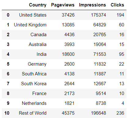
Our newly created DataFrame is shown below.
Now that we have the website data loaded into a DataFrame we can start plotting our bar graphs.
Matplotlib Bar Plots
All bar plots are created using the matplotlib.pyplot.bar method. We'll start with a simple vertical chart where one column of data is plotted before moving on to some more complex plots using multiple columns of data.
Basic Bar Chart
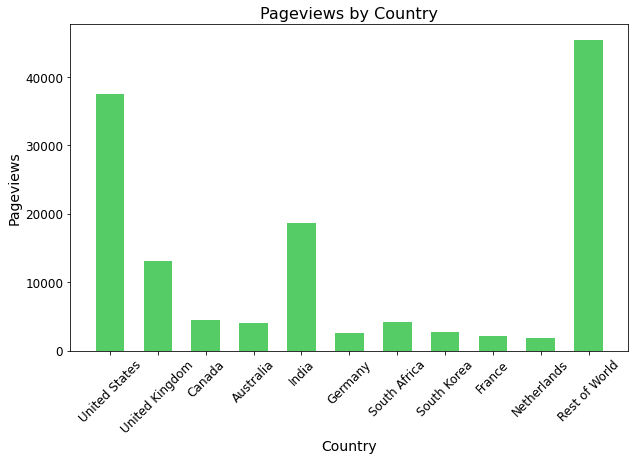
Let's start by plotting the number of website pageviews per country. Our data is broken down into the top ten countries by pageviews and then a generic 'Rest of World' to house the remaining pagviews.
We require three things to generate a meaningful plot.
- A list or dataframe column containing the number of pageviews.
- A list or dataframe column containing the country names corresponding to the pageviews.
- A set of x-coordinates on which to plot the pageview bars.
The number of pageviews by country data is simply extracted from the dataframe that we named df.
pageviews = df['Pageviews']
The list of country names corresponding to the pageviews is also extracted from df.
country_names = df['Country']
A set of x-coordinates onto which to plot the pageviews bars is created by creating a NumPy range array of length equal to the number of bars we wish to plot. This ensures that every bar will be plotted on its own coordinate. Remember to import the NumPy package before trying to use it.
index = np.arange(len(pageviews))
# index = [0,1,2,3,4,5,6,7,8,9,10]
We should also set a bar width which determines how much white space we wish to have between each bar. We'll set a width of 0.6 (60% of the total allocated horizontal bar space) for this example, but you can play around with the value to produce the custom look that you want.
The code required to produce the bar chart is shown below. We are using the Matplotlib object-orientated approach for our plotting by creating a figure (fig) and axes (ax) object through the pyplot.subplots method. If this workflow is new to you then perhaps go through the Matplotlib introductory tutorial before continuing.
pageviews = df['Pageviews']
country_names = df['Country']
index = np.arange(len(pageviews))
bar_width = 0.6

fig,ax = plt.subplots(figsize=(10,6))

ax.bar(x=index,height=pageviews,width=bar_width,color='#55cc66')

ax.set_xticks(ticks=index,labels=country_names,rotation=45,fontsize=12)
ax.set_xlabel('Country',fontsize='14')
ax.set_ylabel('Pageviews',fontsize='14')
ax.set_title('Pageviews by Country',fontsize=16)
for item in ax.get_yticklabels():
    item.set_fontsize(12)
- The actual bar chart is created on the line where
ax.baris called. Here we have specified the x-coordinate points onto which the bars will be plotted (x=index), the height of the bars corresponding to the number of pageviews (height=pageviews), the width of the bars (width=bar_width), and the color of the bars (color='#55cc66'). - The bar labels are created using the
set_xticksmethod.- The x-coordinates of the bars are passed to the
ticksparameter. - The country names to be used as labels are passed to the
labelsparameter. - Since the country names are quite long I have added a rotation to the names, specified using the
rotationparameter, so that the names are clearly visible and don't interfere with each other when the plot is drawn. - The fontsize of the labels are modified through the
fontsizeparameter.
- The x-coordinates of the bars are passed to the
- The plot title and axis titles are created as you would for any Matplotlib plot using the
set_title,set_xlabel, andset_ylabelmethods.
The final plot is shown below.
Plotting Multiple Bars
There are many instances when you may wish to plot multiple bars on a single chart. We'll use our example data to plot the number of impressions and pageviews per country on the same plot.
We'll first show how to do this on a single set of axes and then take it a step further by separating the two y-axes (pageviews and impressions) while keeping a common x-axis to improve the readibility of the plot.
Multiple Columns on a Single Set of Axes
Plotting multiple sets of bar columns on a single plot is relatively straight forward. To do this you must first create a figure and axes object using subplots as before and then call the bar method twice to add two bars to the plot.
You will need to modify the x-coordinate location of the two bar plots by providing an offset so that the two columns don't overlay each other. We do this by simply creating an offset variable and applying a positive and negative offset to the two data arrays to provide sufficient separation.
xindex = np.arange(len(country_names)) # [0,1,2,3,4,5,6,7,8,9,10]
barwidth = 0.3
offset = 0.2

# first bar located at index[i] - offset
# second bar located at index[i] + offset
# 2 x offset > barwidth to ensure whitespace between bars
You can play around with the width of each bar and the offset applied to the center of each bar to produce a plot that looks good. The values shown in the codeblock above will ensure that the two bars do not overlap and allows for a little whitespace between each bar.
The code to produce a bar chart with multiple bars on a single axis is shown below along with the resulting plot. A legend has been added to differentiate between the pageviews and impressions on the plot.
pageviews = df['Pageviews']
impressions = df['Impressions']
country_names = df['Country']
index = np.arange(len(country_names))

bar_width = 0.3
baroffset = 0.2

fig,ax = plt.subplots(figsize=(10,6))
ax.bar(x=index-baroffset,height=pageviews,width=bar_width,
       color='#55cc66',label='Pageviews')
ax.bar(x=index+baroffset,height=impressions,width=bar_width,
       color='#3366cc',label='Impressions')
ax.set_xticks(ticks=index,labels=country_names,rotation=45,fontsize=12)

ax.set_xlabel('Country',fontsize='14')
ax.set_ylabel('Pageviews and Impressions',fontsize='14')
ax.set_title('Pageviews and Impressions by Country',fontsize=16)
ax.legend()
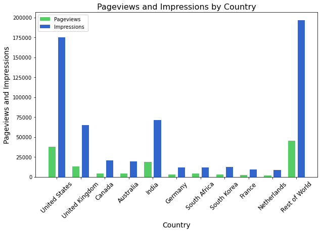
The resulting graph is a little difficult to interpret as the number of website impressions are much greater than the number of pageviews. The bar chart would be much easier to interpret if the impressions and pageviews were split such that each bar is scaled on its own y-axis. We'll look at how to do this next.
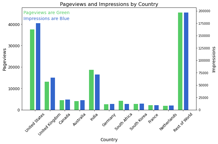
Multiple Columns on Separate Axes
Since the number of website impressions are many times larger than the pageviews there is a lot of information that is lost by plotting the two columns on the same set of axes. A better way to represent the data would be to split the y-axis of the two bar columns while keeping a common x-axis. We do this using the twinx function. This creates twin y-axes sharing a common x-axis.
Our modifications to the previous bar chart are as follows:
- Create a second axis from the first by calling the
twinxmethod. - Add a bar chart to the newly created axis.
- Style the second axis by creating labels, colors etc as required.
pageviews = df['Pageviews']
impressions = df['Impressions']
country_names = df['Country']
index = np.arange(len(country_names))

bar_width = 0.3
baroffset = 0.2

fig,ax = plt.subplots(figsize=(10,6))
ax.bar(x=index-baroffset,height=pageviews,width=bar_width,color='#55cc66')
ax.set_xticks(index,labels=columns,rotation=45,fontsize=12)
ax.set_xlabel('Country',fontsize='14')
ax.set_ylabel('Pageviews',fontsize='14')
ax.set_title('Pageviews and Impressions by Country',fontsize=16)
for item in ax.get_yticklabels():
    item.set_fontsize(12)

ax2 = ax.twinx()
ax2.bar(x=index+baroffset,height=impressions,width=bar_width,color='#3366cc')
ax2.set_ylabel('Impressions',fontsize='14')

ax.text(0.0075,0.94, f"Pageviews are Green",fontsize=14,
        color='#55cc66',transform=ax.transAxes)
ax.text(0.0075,0.88, f"Impressions are Blue",fontsize=14,
        color='#3366cc',transform=ax.transAxes)
I have added two text callouts to identify which bar chart corresponds to which axis in order to interpret the result. Alternatively you could color the Pageviews and Impressions axes to be the same color as the two bars to aid in the interpretation.
You can also produce bar charts that share a common y-axis and twin x-axes with the twiny function. The setup of the chart follows the same methodology as twinx albeit with the axes reversed.
Horizontal Bar Chart
The examples shown thus far have all been completed with vertical bars, but we can also plot horizontal bar charts using the pyplot.barh method.
This works very much in the same way as the vertical bar chart except now you must define a set of y-values onto which to plot the bars rather than a set of x-values.
matplotlib.pyplot.barh(y, width, height=0.8, left=None,
                       *, align='center', **kwargs)
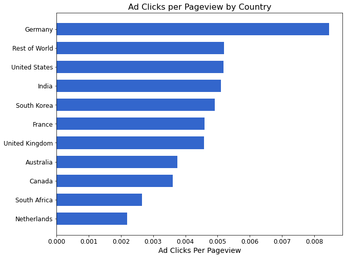
A useful metric to investigate from our dataset is the number of advertisment clicks per pageview for the various countries. Countries with a higher click rate per pageview may represent better opportunities for website monatization.
Since our data is already in a Pandas DataFrame we can easily create a new column called 'clicks_per_pageview' and determine the value for each entry in the column through a simple division of the 'Clicks' column and the 'Pageviews' column.
To aid in the interpretation of the result we will sort the values using pandas.sort_values method so that the click-per-pageview values are sorted in ascending order before being plotted.
df['clicks_per_pageview'] = df['Clicks']/df['Pageviews']
df = df.sort_values(by='clicks_per_pageview')
The code required to produce the horizontal bar graph is shown below. As you look through the code you'll quickly see that the method used to generate the graph is very similar to that of the vertical bar chart.
df['clicks_per_pageview'] = df['Clicks']/df['Pageviews']
df = df.sort_values(by='clicks_per_pageview')

index = np.arange(len(country_names))
hbar_width = 0.65

fig,ax = plt.subplots(figsize=(10,8))
ax.barh(y=index,width=df['clicks_per_pageview'],height=hbar_width,color='#3366cc')
ax.set_yticks(ticks=index,labels=df['Country'],fontsize=12)
ax.set_xlabel('Ad Clicks Per Pageview',fontsize=14)
ax.set_title('Ad Clicks per Pageview by Country',fontsize=16)
for item in ax.get_xticklabels():
    item.set_fontsize(12)
The resulting horizontal bar graph is shown below. Because the data has been ordered prior to plotting it becomes very clear which countries produce the most clicks per pageview from just a quick glance at the chart.
This brings us to the end of this tutorial on generating bar charts in Matplotlib. Bar charts are an important tool in any scientist or engineer's toolbox and Matplotlib makes it easy to generate these plots and customise them to suit your exact needs.
Thanks for reading this tutorial and please remember to share it if you found it useful as this is how we grow our online community.